Friday, December 4, 2015

SharePoint - Responsive Design (Framework)

You can go to my previous post where I have explained how to implement responsive design in a SharePoint site using Bootstrap from scratch. Now we you will quickly figure out that implementing responsive design from scratch will take a lot of time, effort and learning. So in order to save time we will use a pre-built framework developed by a team of awesome people.

Perform following steps for SharePoint Online sites:
  1. Download the WSP.
  2. Follow page 17-22 of the documentation.
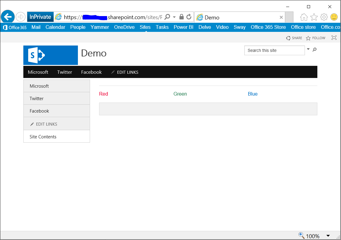
  3. And the site will look like this:
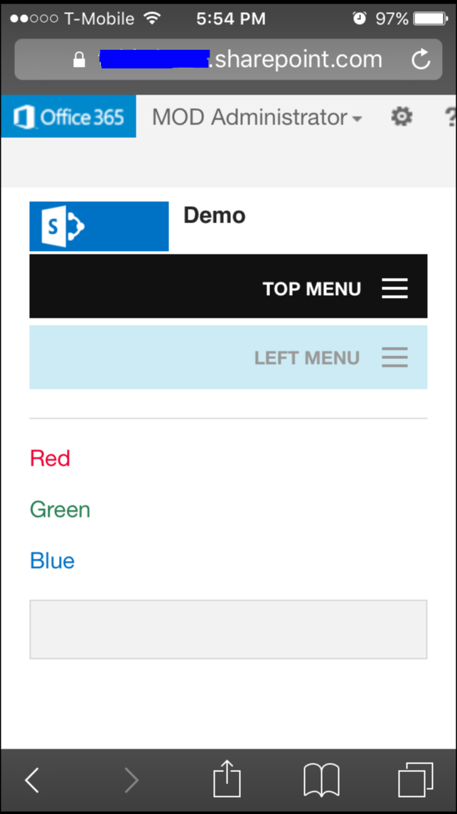


    Desktop
    Mobile
  4. Now after the site has been made responsive and works all great. You can download the Master Page foundation-4.3.2-server.master and customize according to your own branding. See pages 23-25 of the documentation.


No comments:

Post a Comment

Official SharePoint Documentation

I have recently contributed to the official SharePoint documentation for developement. Check it out here: https://docs.microsoft.com/en-us...